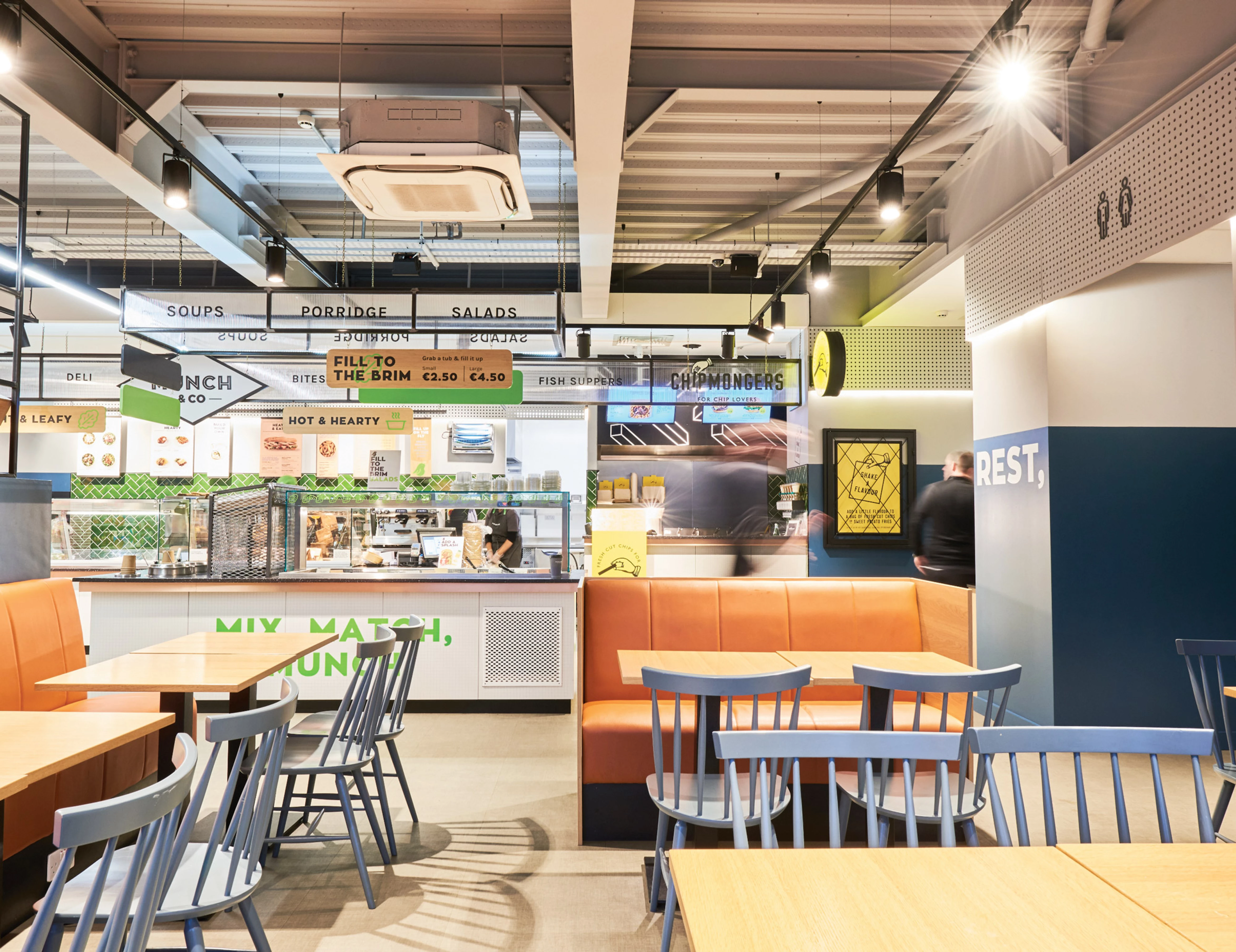
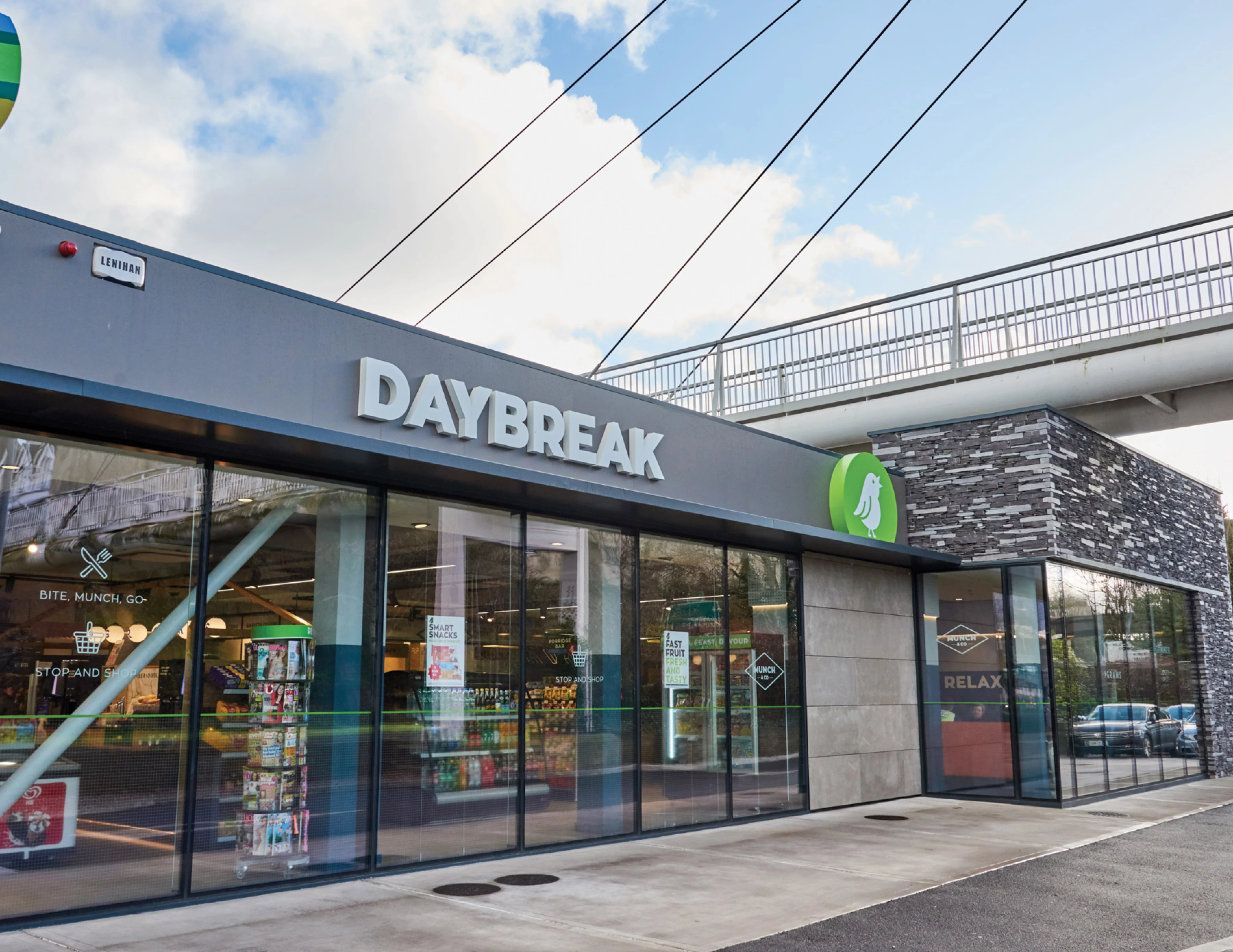
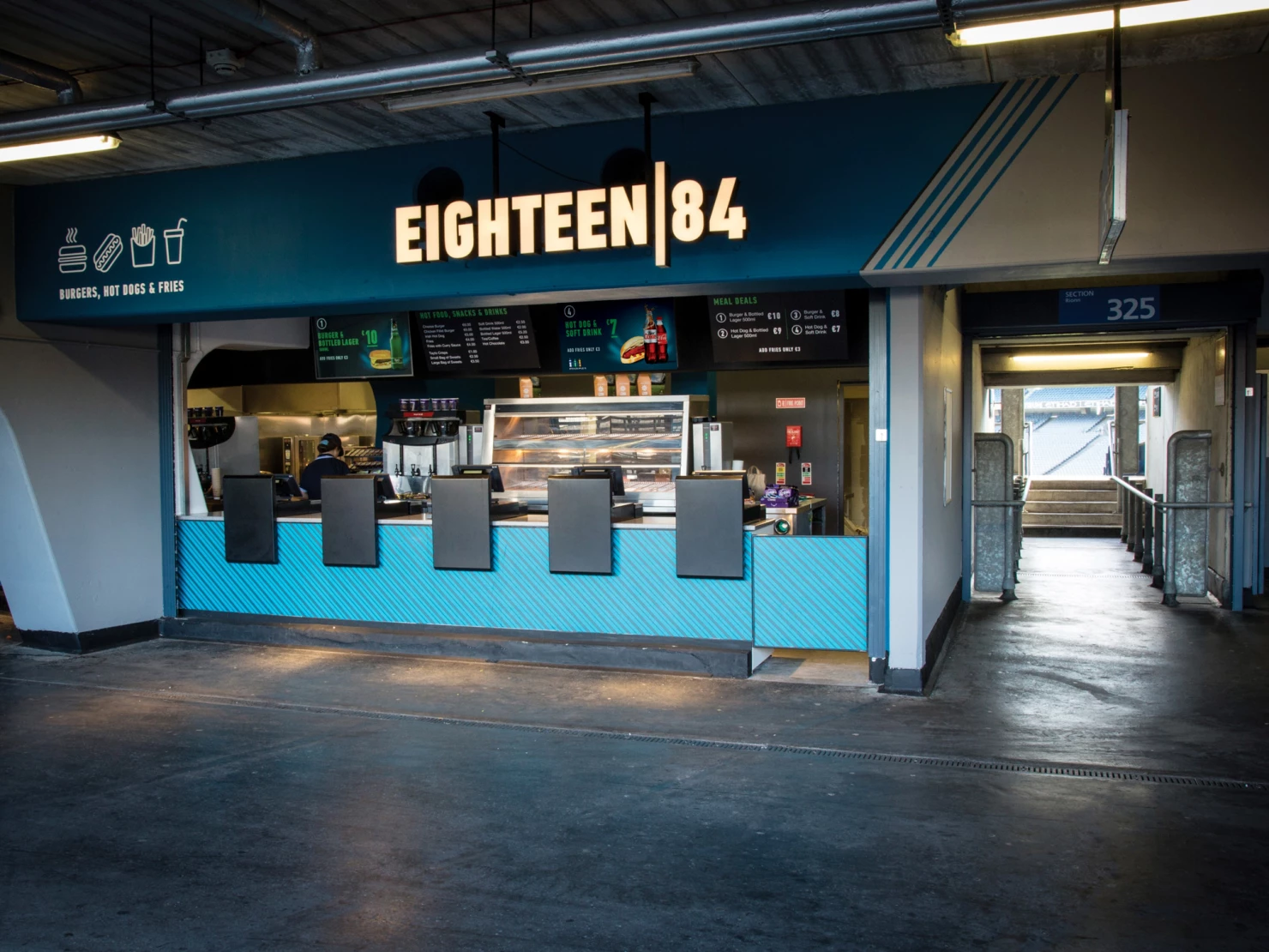
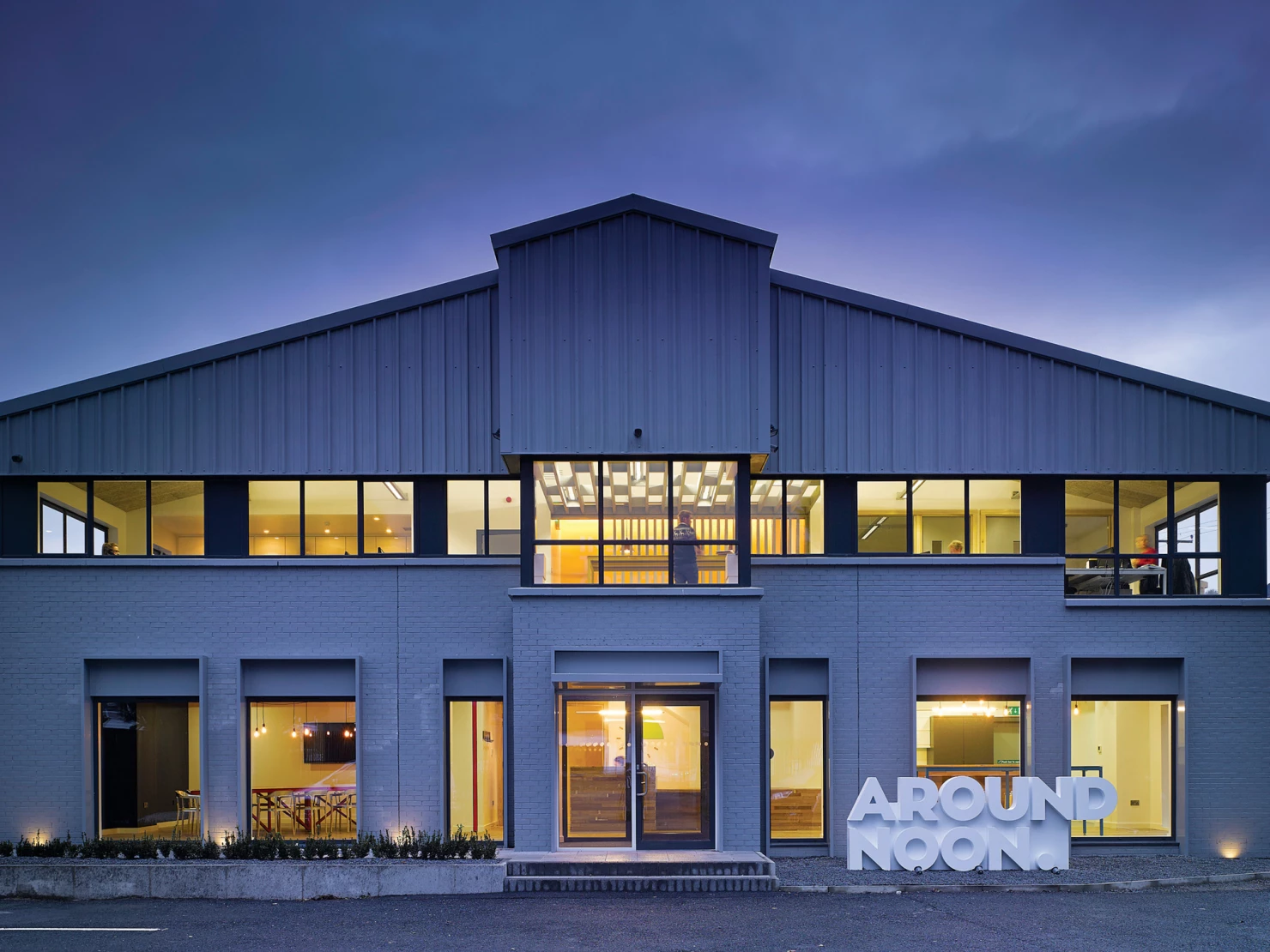
Having worked with the Musgrave Group on the successful launch of Chipmongers they asked us to help them refresh Daybreak, a convenience store chain with over 170 locations across Ireland. The brand had grown tired and needed a reinvigoration to make it relevant and keep up with consumer trends.
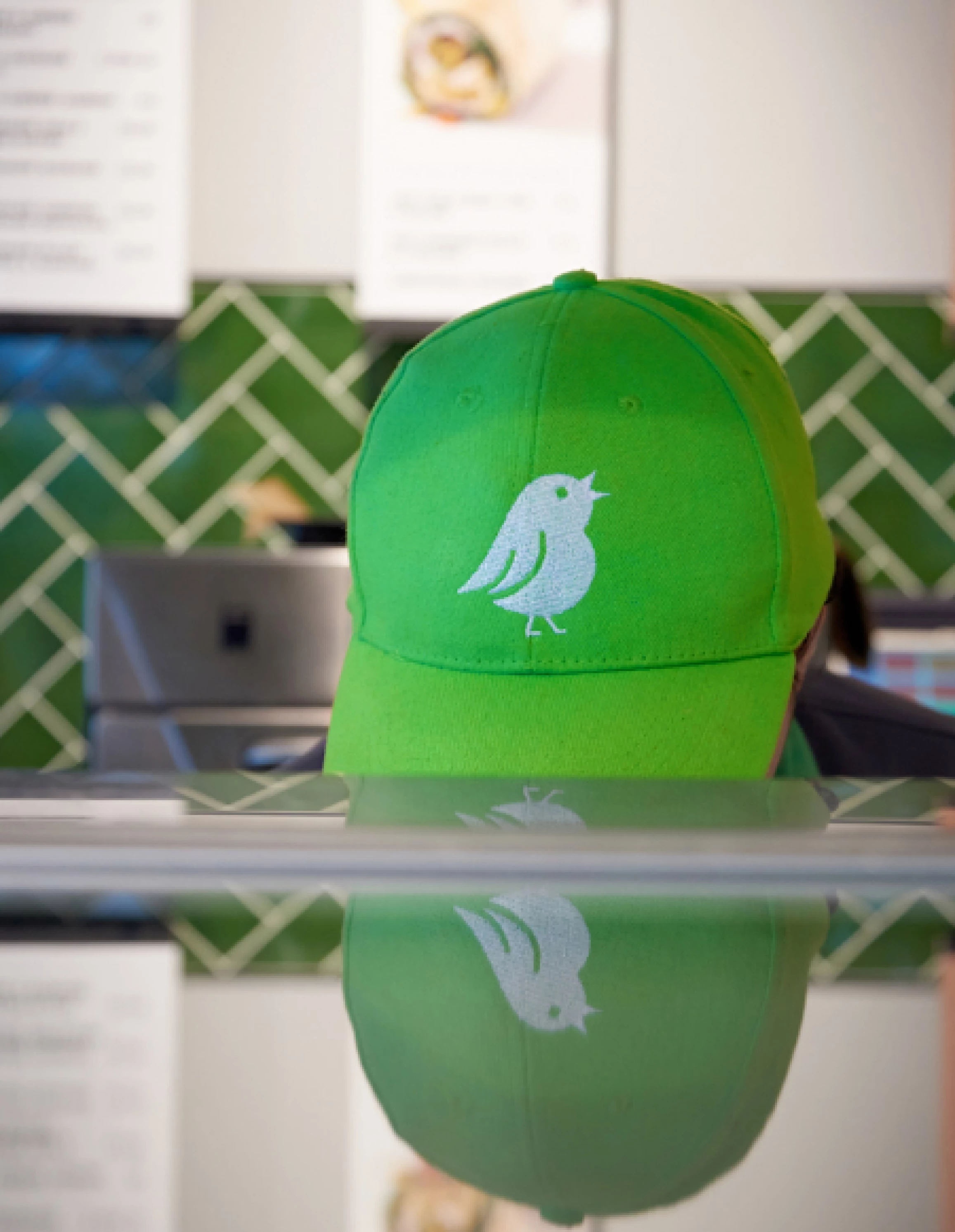
The call of the blackbird
We wanted to create an identity that was bold and bright, calling to people who walk past. We felt what better way to represent ‘daybreak’ than the blackbird – one of the first birds you will hear signing in the morning. We created a symbol of the bird, which is featured at scale outside every Daybreak, perched on a zingy green roundel shaped like the rising sun.
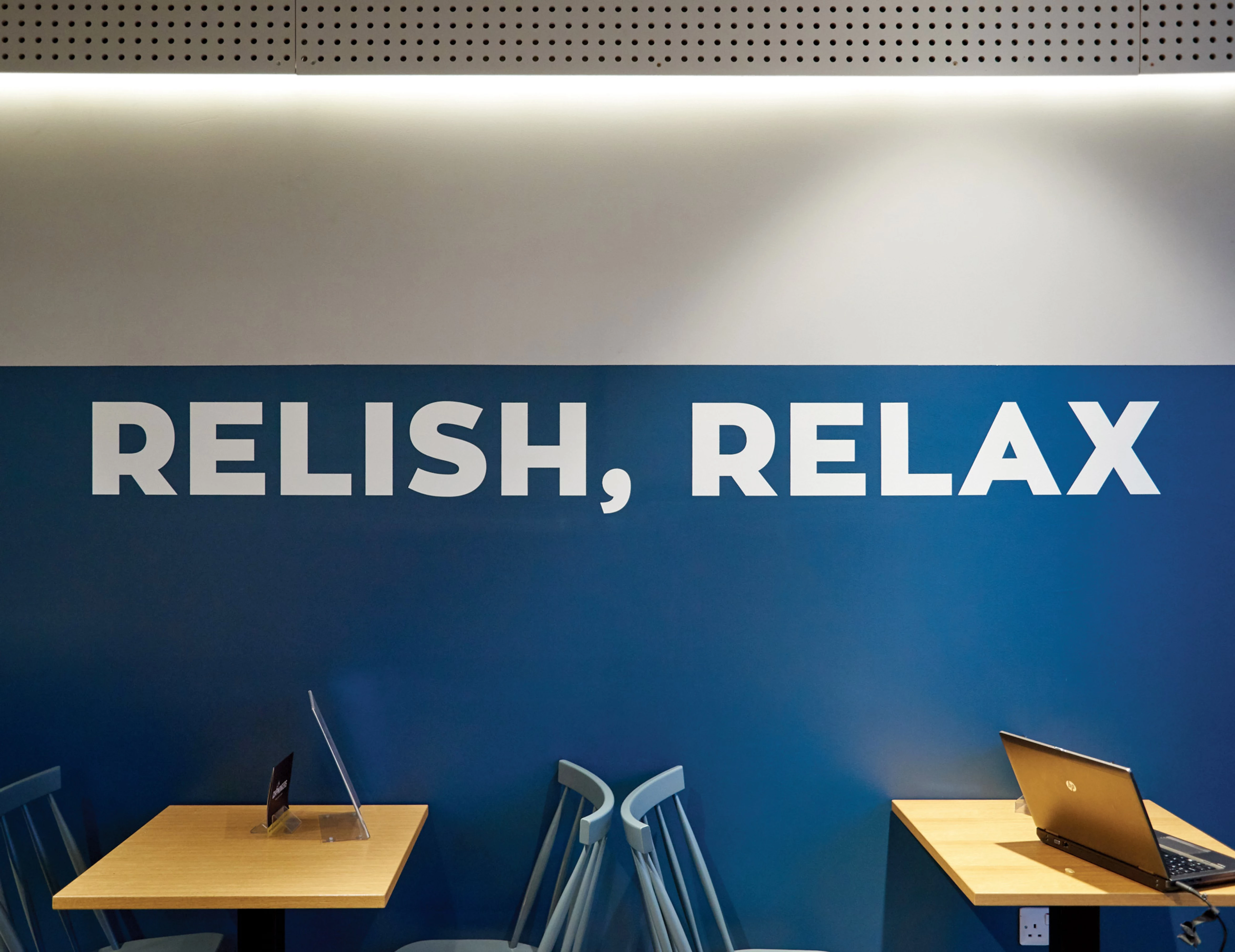
Interior vision
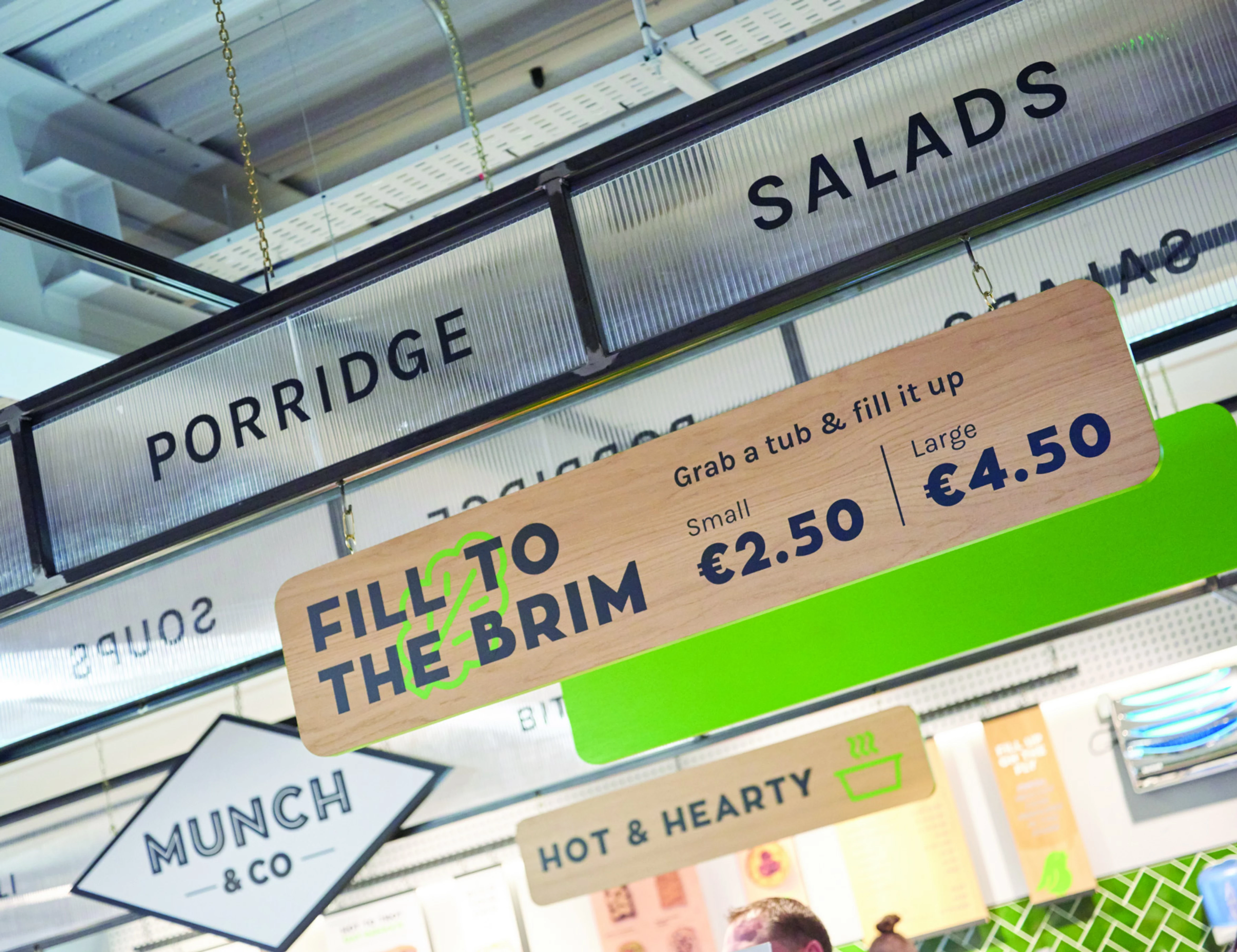
We worked closely with interior architects 21 Spaces to imagine the Daybreak ‘store of the future’ and roll it out to a test store in Cork. As part of this work we designed a new identity for the brand and worked on everything from tone of voice and signage right through to packaging and social media.
