Spadetown
Brewing Co.

Bringing a Lurgan in-joke to the wider public, in can form.

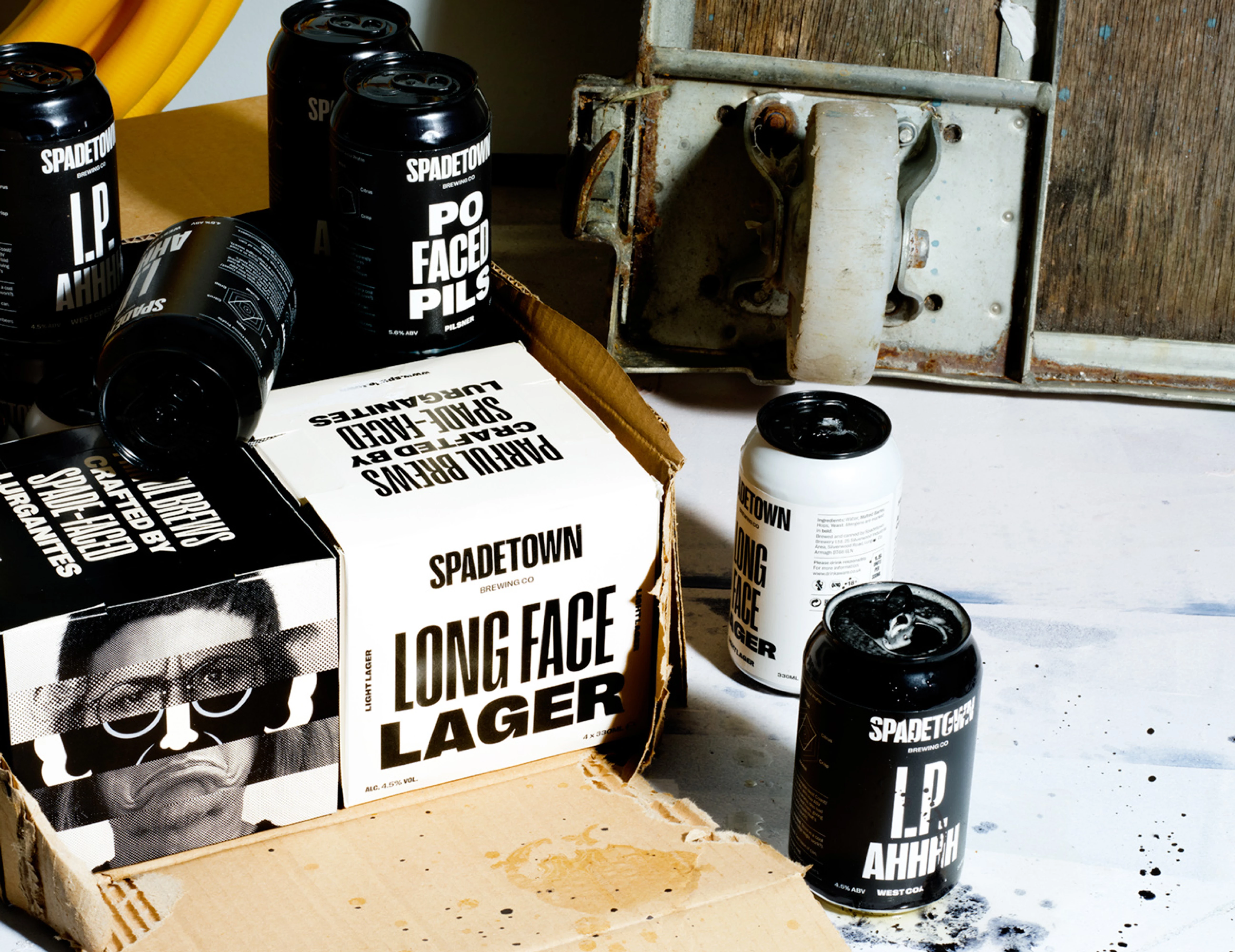
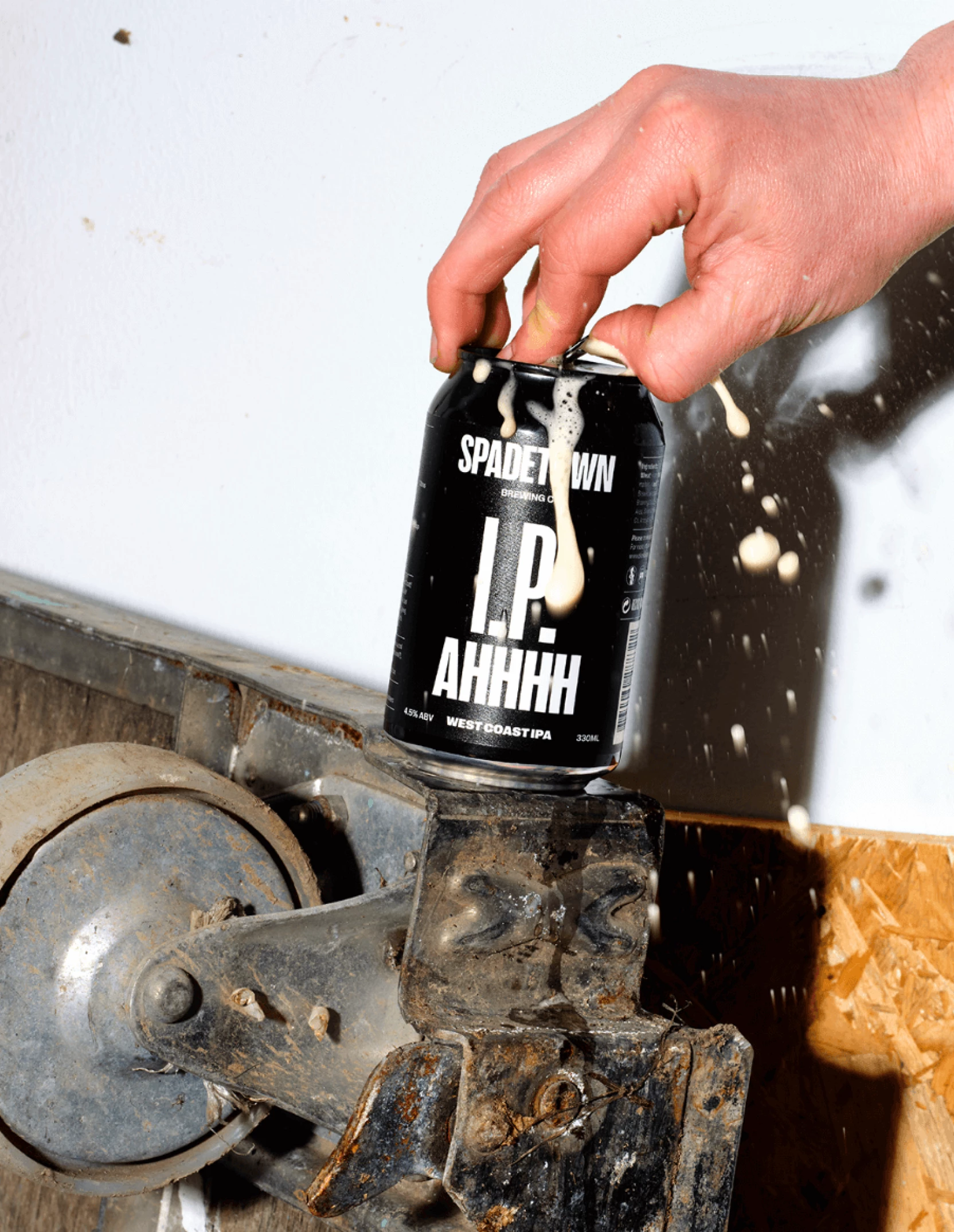
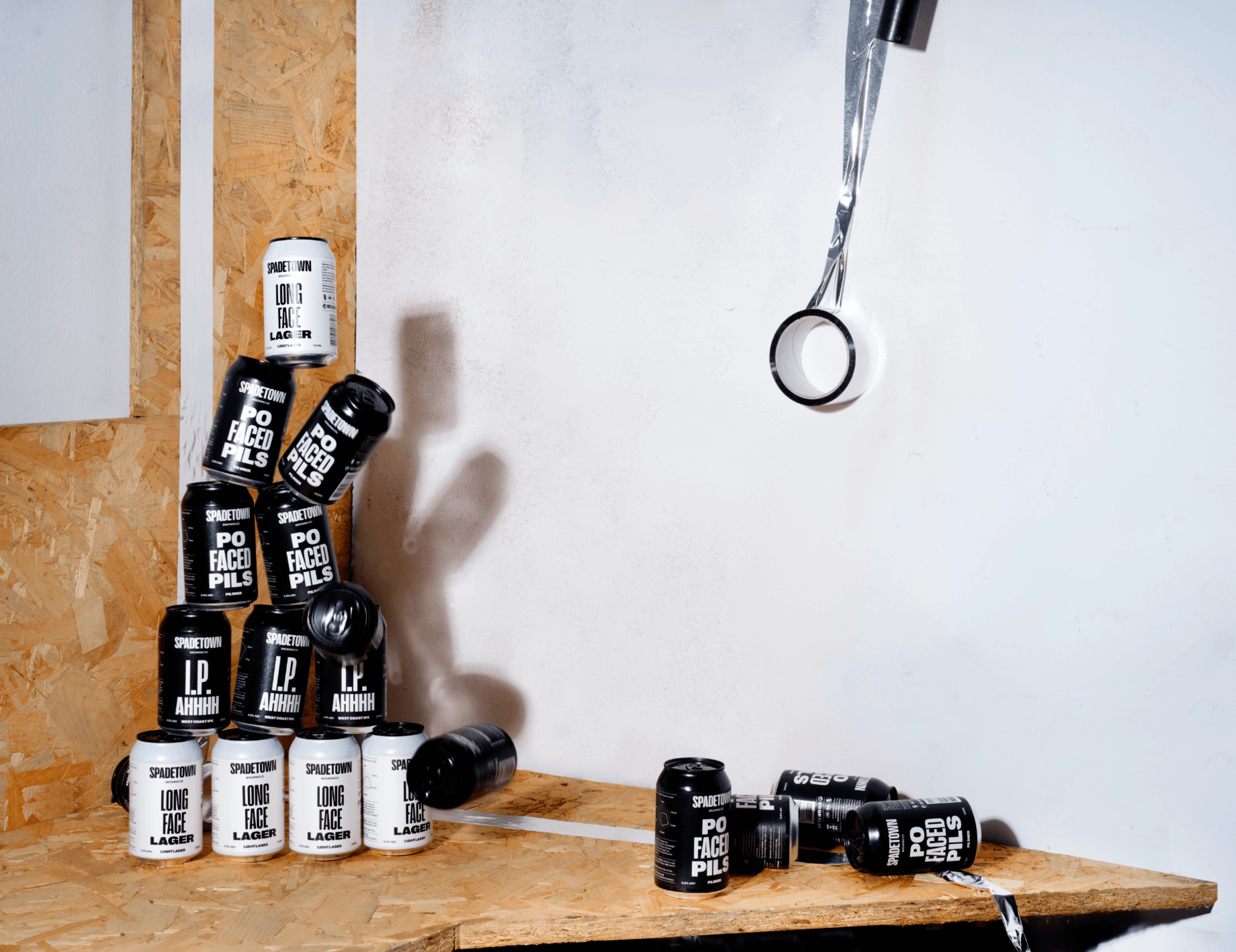
We were engaged by the team at Spadetown to create a brand identity for Lurgan’s first craft brewery. Three friends who had travelled far and wide in their careers, returned to their hometown with a master plan to celebrate all the quirky uniqueness that it offers, through the wonderful medium of some crackingly ‘parful’ craft beers.

“Face as long as a

Lurgan spade on ye!”

MEANING

To look miserable. To have a big moany head on you. To have a face like a smacked arse. To be a sour puss. To be a po-faced cranky pants. To look like you’re in the pits. To be a big auld misery guts. To be a massive moper. To be a Negative Nancy.

ORIGINS

A longstanding jibe from our client’s hometown of Lurgan Co.Armagh, this commonly used expression’s origin relates to the plight of the over-worked and under-paid workmen who painstakingly dug what is now the Lurgan Park lake.

Spadetown: Parful Brews Crafted by Spade-Faced Lurganites

The sense of humour embedded in the Lurgan psyche was something we wanted to hero. To pay homage to the name’s origins, you couldn’t ignore the simply… ‘Irish’ tendency to love a bloody good moan and a good slagging… who doesn’t love a bit of misery?

Visually, the brand plays on the concept of ‘long faces made short’ through stretching and shrinking typography, a series of sad-faced iconographic illustrations that mimic the shape of a Lurgan spade (and the 1/2 bap glass), with supporting flexible ‘identikit’ style imagery of the variety of mopey ‘bakes’ of Lurgan. Product names and copywriting celebrate the miserable with a Northern Irish twang. A bold, personality-filled typographic style and a minimalist contrasting palette representing a lighthearted darkness was used to create standout on shelf. In the digital realm, we developed a website that delivers Spadetown’s story in a way that’s engaging and fun for users, featuring interactive dynamic typography, and setting the mood with a playlist for all the ‘sad bastards’ out there.

What we did

  • Brand Identity
  • Brewery Signage
  • Social Media Style
  • Product Naming
  • Packaging Design
  • Environmental Graphics
  • Storytelling
  • Merchandise
  • Website
  • Motion Graphics
  • Art Direction

Awards

ICAD 2022
Silver Bell
Identity & Branding

ICAD 2022
Bronze Bell
Packaging

IDI 2022

Winner

Packaging: Food & Drink

Publications

The Dieline
Featured Article

Collaborators

Photography
White Cloud Photographic

Web Development
Thought Collective

Video Product
JComms

Related projects