Paul Yates

A poetic fusion of art and literature.

Paul Yates is a Belfast born poet, artist, and filmmaker, with a body of work spanning almost six decades. Aptly put by his patron, Lord Glentoran, ‘Paul has intuitive gift for language and remarkable imagination’. His career began at an early age, spurred on by his English teacher at the time, artist Jack Pakenham. He amassed a significant body of work throughout his career and has had multiple books of his poetry published. He sought to capture his life’s work in one piece however, which is where we enter his story.

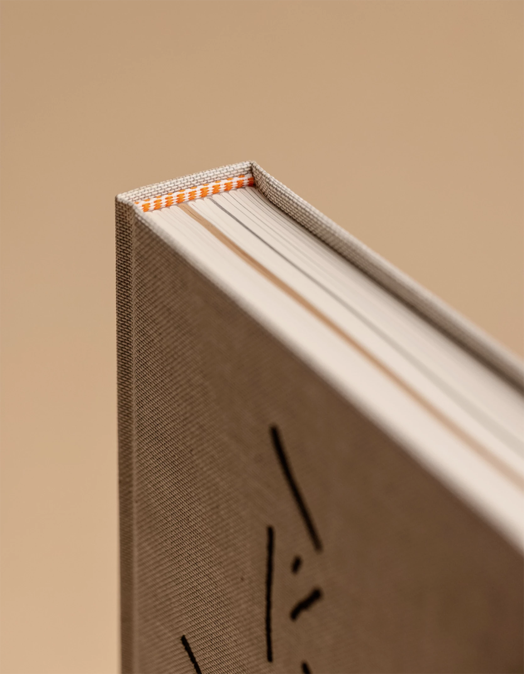
Key to our design approach was restraint, allowing the artist’s work shine rather than distract from it.
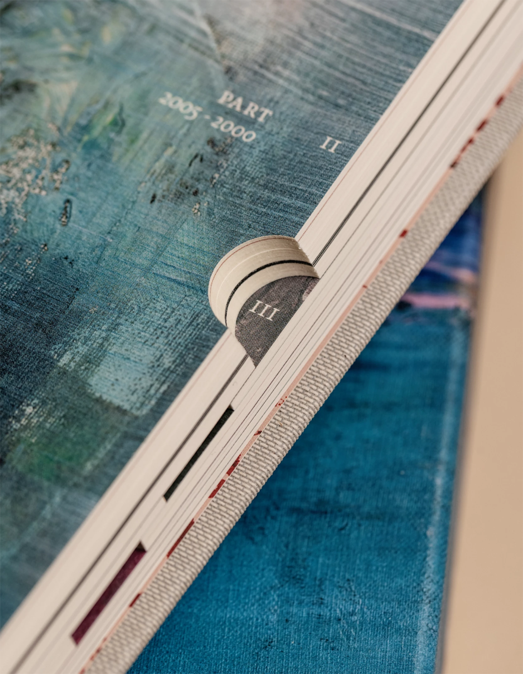
ELEGANT MINIMALISM

The text style and layout are minimal, stocks and materials were selected to harmonise with the content. The size and proportion of the book were chosen to best represent the poetry.

Creating a meandering journey.

The book is laid out in reverse chronological order – though the poet was keen that the reader could explore any section at will. To this end, we introduced a thumb tab device, something generally reserved for bibles and address books. Paul is analogue in his approach - drafts of amends would arrive to us printed and neatly marked up in a binder. The thumb tab device is a nod to that aspect of his personality, as well as serving a navigational function.

Pacing in the Layout

We made some design decisions to pace the book and create rhythm. We selected some of Paul’s paintings for display on section divider pages, a little of each is visible through the thumb cut outs. The haiku section is distinguished by a change in paper stock.

A Unique Touch

Paul’s handwriting is unique, and he writes with red ink. It features at scale on sub divider spreads and on the cover, and his distinctive blotting paper on the end papers. The book is protected by a slipcase featuring a full wrap around of his painting ‘Marine Tattie Bogle’. The burst of colour contrasting with the sparsity of the cover design. Altogether, it is a book designed in concert with the artist’s work.

What we did

  • Book Design
  • Print Management
  • Photography Art Direction
Lord Glentoran
Patron

Slater Design have been outstanding in producing a beautifully rendered volume with inspired layouts and daring use of colours, papers and textures. Exquisitely cut and toned thumb indexes effortlessly divide the work into seven key sections. The deft setting and spacing of the poems on the page, high-quality binding and slipcase, set this book apart. A true pleasure to handle and read from. Content, form and function in perfect harmony. Slater Design far exceeded our ambitions for this project, I am proud to be associated with it.

Collaborators

Photography
Al Higgins

Print
KOPA

Related projects