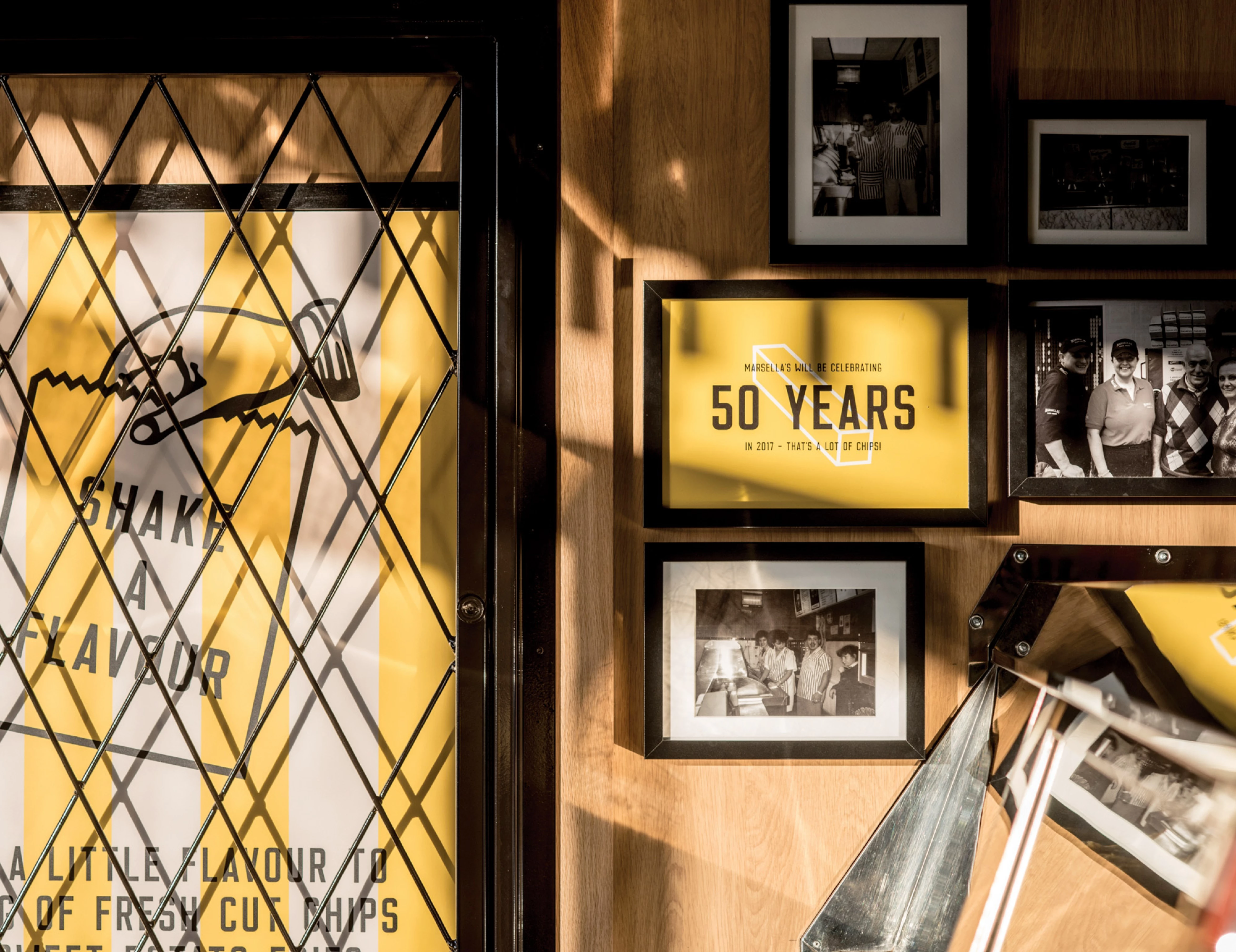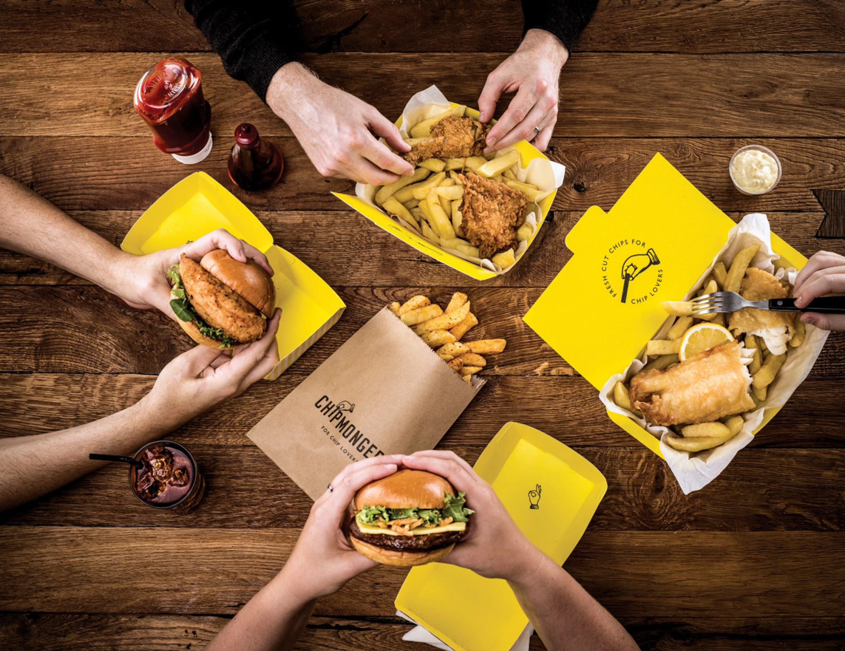
We were briefed to design a brand for a collection of chip shops that could grow into a UK and Ireland wide chain. Chippers were struggling against both their traditional competitors in the fast food chains and also smart new fast-casual offerings on the high street. The new brand needed to retain the ‘local chipper’ charm and retain the rich history and tradition while still creating a brand to appeal to a new generation.
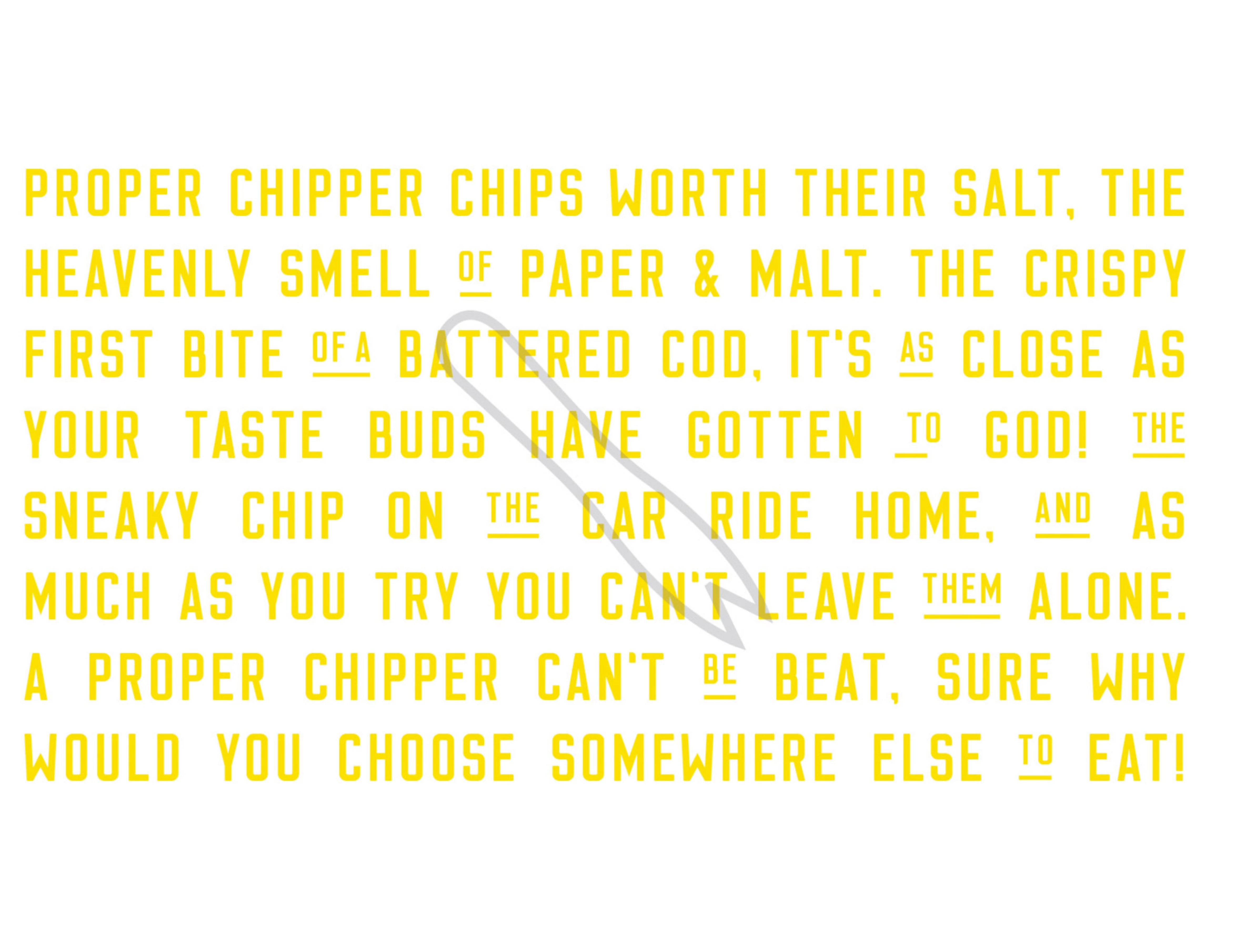
“The crispy first bite of a battered cod, it’s as close as your taste buds have gotten to God!”
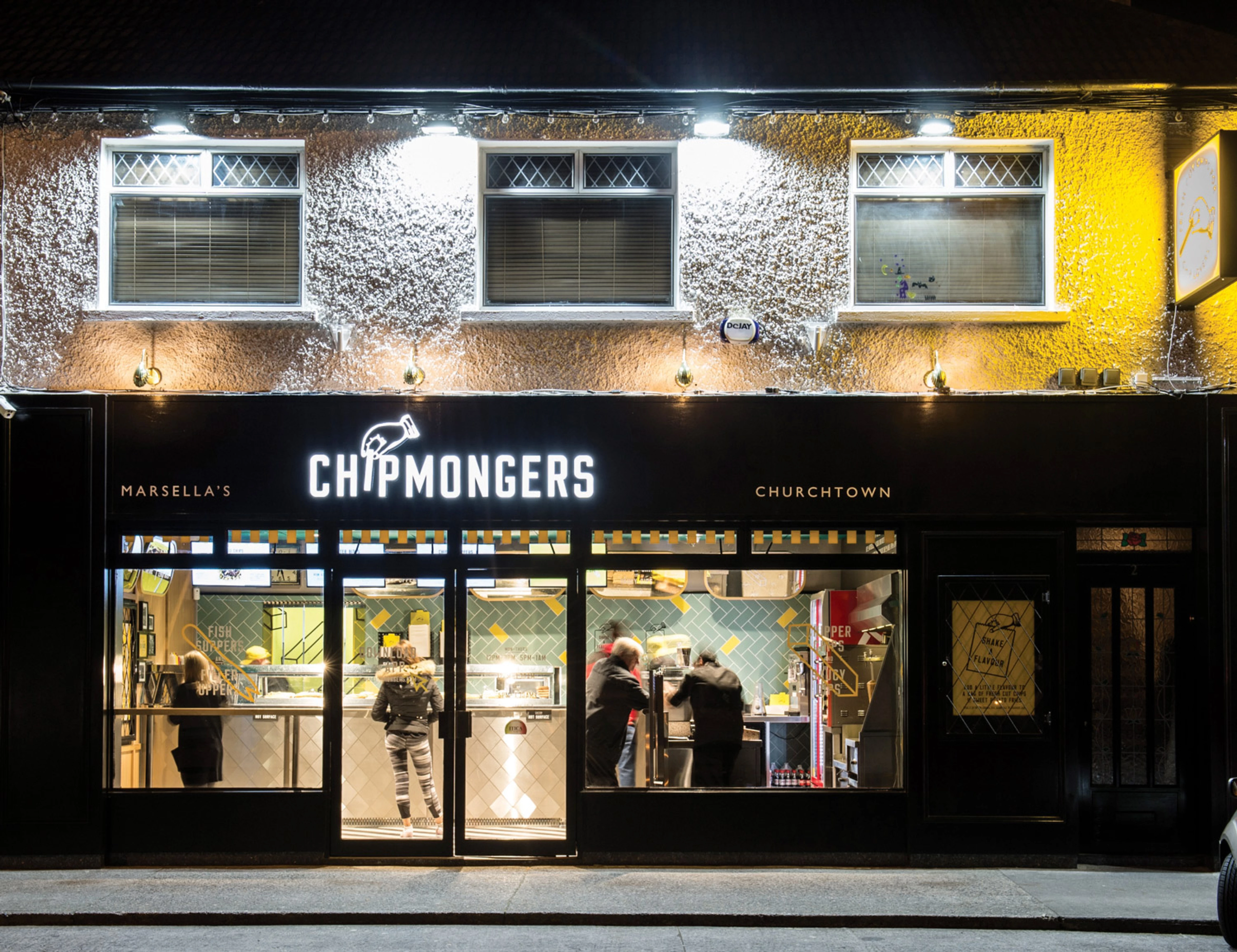
Naming
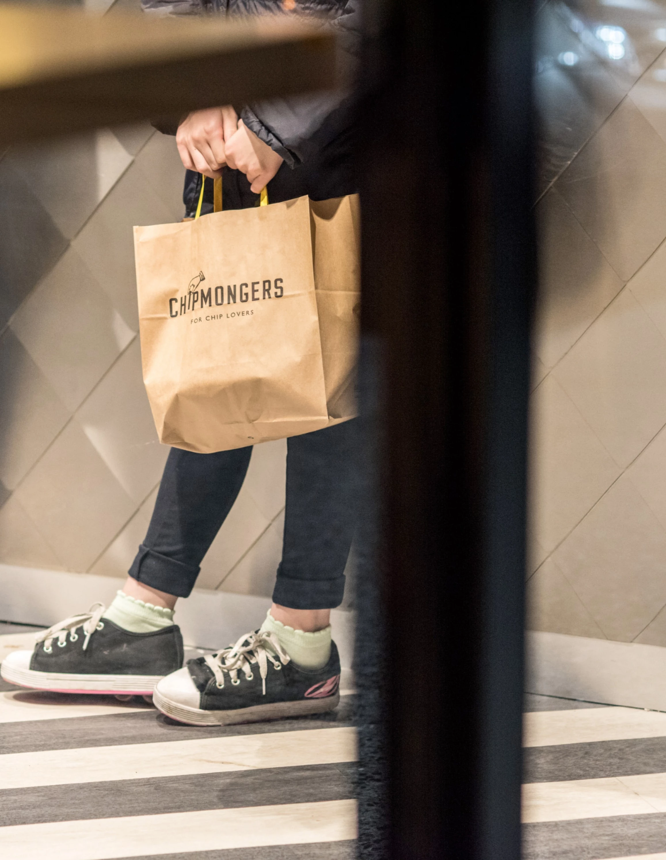
The first job was to come up with a name. A lot of exploration (and a couple of bags of chips) later, we settled on ‘Chipmongers’. Inspired by the word ‘fishmongers’, we felt it represented the two heroes of the offer in equal measure – fish and chips. It also communicated the idea of craft. For the logo, the letter ‘I’ was transformed into a tempting chip, with the hand unable to resist picking it up.